
Create > Low Light Interior Charcoal Drawing

Goal:
Accurately render the quality of low light in an interior space
Access Prior Knowledge:
Instructional Strategy
- Generate Mental Images
Learning Activity
Imagine > The Rule of Thirds Grid on your paper.
Place the area of emphasis (the light source) on a line of third or the intersection thereof.
New Information:
Instructional Strategy
- Deepen Understanding
Learning Activity
Understand > How to draw light with charcoal and eraser
Using charcoal is a good way of learning gray gradients and lighting techniques.
Indoor lighting is softer and more diffused. Light tends to bounce of objects and walls. Light is such an important ingredient of the visual arts, take note of the quality of lighting and use it to distinguish the lights and the darks on your paper.
- With a charcoal stick fill an entire paper until it is entirely covered and black.
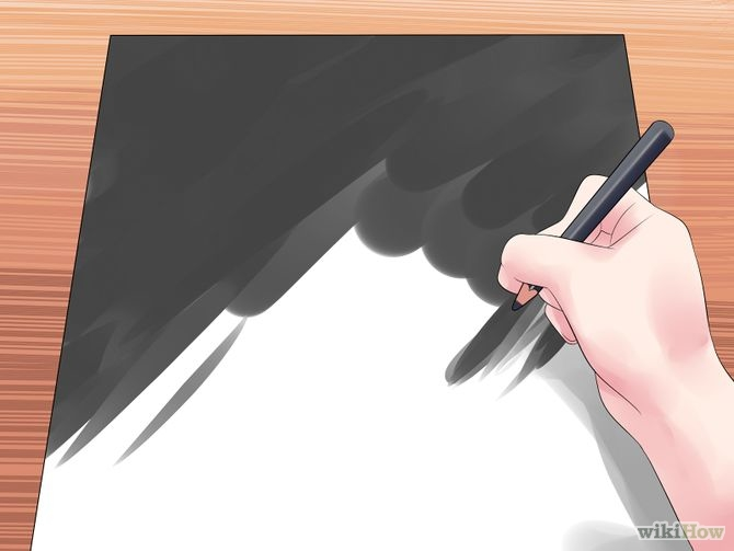
- With an eraser draw out the contours and forms.
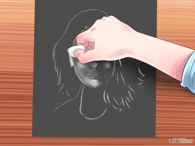
- Work back into the piece with charcoal and take away with the eraser as needed.
- Continue working in this additive and subtractive method until your image is fully developed
Apply Knowledge & Skills:

Instructional Strategy
- Nonlinguistic Representations
Learning Activity
Create > Low Light Interior Charcoal Drawing
- Set up an interior space that is illuminated by a single low light source
- Position yourself so you are facing a corner or looking into the room from another space
- Imagine the rule of thirds grid on your paper and place the area of emphasis or the low single light source along a line of thirds or on the intersection of two of them.
- Use the eraser to draw the light and any areas that are illuminated by the light.
- Continue to draw and erase the emergence of visible forms.
- Try to keep the lighting quality soft and low.
Visual Examples:
Generalize, Reflect & Publish:
Instructional Strategy
- Evaluate the results
Learning Activity
Reflect > Should I go back and rework anything?
- How did you combine art elements (line, color, shape, texture, value) to develop art principles? (Unity/variety, balance, emphasis contrast, rhythm, proportion/scale, figure/ground relationship)
- Where are the dominant shapes, forms, colors, or textures that carry expressive significance?
- Why Is the work ordered and balanced or chaotic and disturbing?
- What gives the work its uniqueness?
- Is symbolism used in the work to convey meaning other than what one sees?
- Does the work evoke any feelings?
Instructional Strategy
- Providing Recognition
Learning Activity
Publish > Share your album to our G+Community > Concepts & Creations category
Display > Add your photos to the Event
Instructional Strategy
- Providing Feedback
Learning Activity
Critique >
- Give positive feedback > +1 every image that deserves it
- Give peer feedback > Give 2 peer images a VTS critique > http://goo.gl/1WWmBY
Self-assess >
- Evaluate > Thinglink Rubric Scoring Guidelines > http://goo.gl/ejQq7B or AP Padlet Scoring Guidelines > https://goo.gl/a70ikP


No comments:
Post a Comment