
“ Be at Critique. - My best advice.” ~ E. Haskell ‘05
Your work MUST be up at the critique on Friday if you want it graded Monday, even if you’re sick the day of a critique (period), even if it’s an excused absence (period).
If you can’t be there for ANY reason, be sure to have someone bring your artwork to class Friday and get it back to you that night so it is ready for grading Monday.
I WILL NOT GRADE ANY ARTWORK THAT HAS NOT BEEN UP AT THE CRITIQUE.
Now for the best part. Here is how an art instructor colleague put it...
“But let’s say you’re behind because you procrastinated and/or started over three times and now it’s Friday and you’ve got nothing, zip, zilch, nada a smidgen of an inkling of one ioda. . So you decide to just cut AP that day so you won't get that look from me when I ask you why your work isn’t on the wall. You know the look… “
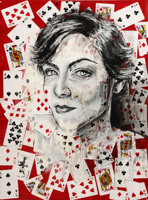
The King, by Kristia Bondoc, 2014
“But remember, being present for and participating in critiques is worth 50 points, your art is worth 100 points. So if you cut class Friday to skip the Critique, then I’m not grading your art on Monday, therefore you’re getting a grade of 0/150, the biggest “F” imaginable. Then, you’ll get this look…”
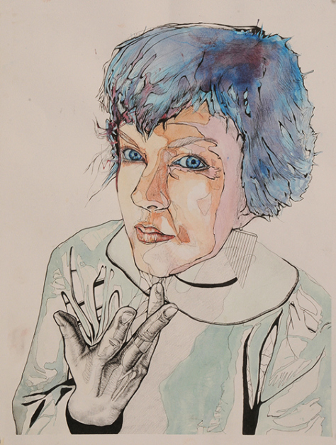
The Look by Paola Lopez, 2010
“Even if you had an “A” before, blowing off a critique will literally KILL that good grade. Don’t do it. Just man up and be there and participate so I can give you at least 25 points just for tossing out a few comments about the other work in the critique. Or even better, put SOMETHING, ANYTHING up, even if it’s the version you had to dig out of the garbage, so that I can give you some points and possibly grade the thing on Monday and not have to explain why you’re suddenly failing to your parents. OK? Then, I’ll give you this look…”

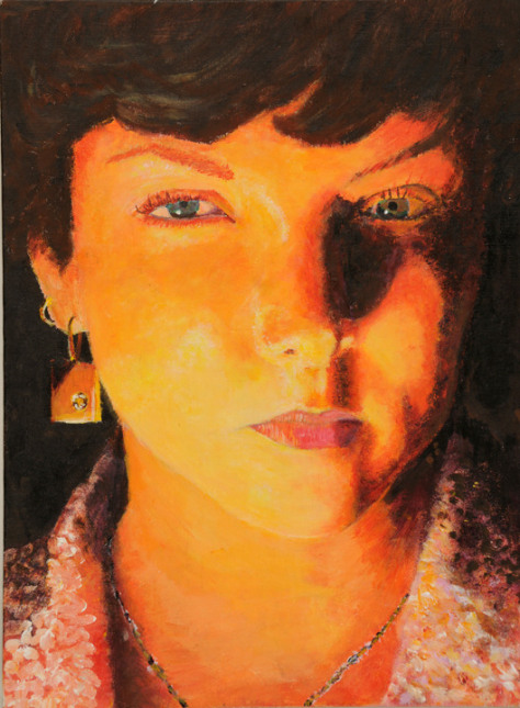
King by Chelsea Rinsel, 2012
“If it’s a total piece of garbage that you’re tacking on the wall and YOU know you could’ve done so much better (if only you hadn’t put it off until Sunday afternoon…) you can REDO it later to improve your grade. But Redo’s are VERY LIMITED. Don’t waste them. I do know how hard it is to stand in front of art that you’re, ahem.. less than proud of, but it’s part of the process. Next time, hopefully, you will not make the same mistake. However, being there and participating and putting up your work (even if you HATE it) really will SAVE YOUR GRADE.
Not doing so? Well… the assignments are like dominoes, my friend, and when you fall behind on one you’ve got two to do by the next critique and well that’s just too much, I mean you’ve still got homework for your other classes, and your parents haven’t let up and then there’s your social life, or lack thereof… Get my point?
Glad we’re all on the same page.
Keep up with critiques so you don’t get this look…”
Your work will be critiqued THE DAY BEFORE IT’S DUE so that you have the opportunity of using the valuable feedback from your peers at the critique and apply it to your work as you complete it. Learning to critique art is a vital part of an artist’s growth. It’s important to critique yourself as well as other artist’s work. I really believe that the critiques we have in AP art teach you much more than any other aspect of the class.
Critiques are NOT optional. If you don’t put your work up for critique, I will not grade it the following day. Seriously. And if your art isn’t at least 80% complete, we will not critique it.
You can get up to 50 points for a critique- 25 for putting up a piece of art that’s at least 80% finished, and another 25 for participating by giving a few comments to your fellow students when it’s their turn to stand nervously in front of their art. If you neglect either part of your responsibility in the critiques you’re only getting 25/50, not good! So be sure to participate and have your art up on the wall.
We’ll always strive be courteous and constructive. I encourage positive phrasing and focus on each artwork’s strengths first. Avoid words like “favorite,” “the best”… Focus on the objectives of the assignment!
- What really caught my eye was ________.
- That artwork shows ______ really well.
- That artist is really skilled at _________.
Then go to CONSTRUCTIVE criticism…
- I think _______ would improve that artwork.
- I’d like to see more of __________.
- I am a little confused by ________.
- Don’t say “finish it”. That’s a given!
Below is an example of a critique form to jot down your thoughts so you’re prepared when it’s your turn to speak about your work, or when you’ve got comments for your fellow artists:
Critique Directions:
- Display your artwork and put your name on a note under your piece.
- After all the work is up, do a “gallery walk” to carefully look at all the art.
- Choose 3 different pieces of art to write about. Focus your writing around the Elements and Principles of art and the requirements of the assignment.
- Write the artist’s name and medium used on the lines provided.
- Offer two positive comments focusing on the elements and principles of art. Refer to the copy of the Elements & Principle of Art > http://goo.gl/me4Zgu handout if you need help.
- Offer one constructive criticism. (something that could be improved.) Be as specific as you can and do not say “finish it”. Consider what could be changed or added to make the piece better!
- Finally, write about your own work.
Peer Artwork 1: Artist:_______________________ Medium:________________________
- Offer two positive comments in reference to the dominant elements & principles used.
- Offer one constructive criticism as to what could be changed or altered to improve the parts of the work that are finished now?
Peer Artwork 2: Artist:_______________________ Medium:________________________
- Offer two positive comments in reference to the dominant elements & principles used.
- Offer one constructive criticism as to what could be changed or altered to improve the parts of the work that are finished now?
Peer Artwork 3: Artist:_______________________ Medium:________________________
- Offer two positive comments in reference to the dominant elements & principles used.
- Offer one constructive criticism as to what could be changed or altered to improve the parts of the work that are finished now?
Your Artwork: Artist (your name):___________________Medium:_____________________
- List the visual references you used to create this piece.
- Offer two positive comments in reference to the dominant elements & principles used.
- What could be changed or altered to improve the parts that are finished now?
- What do you still have planned for the unfinished parts of this piece?
(be specific- do not say finish it!) - Make note of any feedback from today’s critique that you think was helpful and would like to incorporate into the piece before you turn it in.
Elements of Art
Line is a mark with greater length than width. Lines can be horizontal, vertical, or diagonal, straight or curved, thick or thin.
Shape is a closed line. Shapes can be geometric, like squares and circles; or organic, like free-form or natural shapes. Shapes are flat and can express length and width.
Forms are three-dimensional shapes, expressing length, width, and depth. Balls, cylinders, boxes, and pyramids are forms.
Space is the area between and around objects. The space around objects is often called negative space; negative space has shape. Space can also refer to the feeling of depth. Real space is three-dimensional; in visual art, when we can create the feeling or illusion of depth, we call it space.
Color is light reflected off objects. Color has three main characteristics: hue or its name (red, green, blue, etc.); value (how light or dark it is); and intensity (how bright or dull it is). White is pure light and black is absence of light. Primary colors are the only true colors (red, blue, and yellow). All other colors are mixes of primary colors.
Texture is the surface quality that can be seen and felt. Textures can be rough or smooth, soft or hard. Textures do not always feel the way they look; for example, a drawing of a porcupine may look prickly, but if you touch the drawing, the paper is still smooth.
|
Principles of Art
Balance is the distribution of the visual weight of objects, colors, texture, and space. If the design was a scale, these elements should be balanced to make a design feel stable.
Emphasis is the part of the design that catches the viewer’s attention. Usually the artist will make one area stand out by contrasting it with other areas. The area will be different in size, color, texture, shape, etc.
Movement is the path the viewer’s eye takes through the artwork, often to focal areas. Such movement can be directed along lines, edges, shape, and color within the artwork.
Pattern is the repeating of an object, symbol, or shape all over the artwork.
Repetition works with pattern to make the artwork seem active. The repetition of elements of design creates unity within the artwork.
Proportion is the feeling of unity created when all parts (sizes, amounts, or number) relate harmoniously to each other. When drawing the human figure, proportion can refer to the size of the head compared to the rest of the body.
Rhythm is created when one or more elements of design are used repeatedly to create a feeling of organized movement. Variety is essential to keep rhythm exciting and active and to move the viewer around the artwork. Rhythm creates a mood like music or dancing.
Variety is the use of several elements of design to hold the viewer’s attention and to guide the viewer’s eye through the artwork.
Unity is the feeling of harmony between all parts of the artwork, creating a sense of completeness.
Dominance is the importance of the emphasis of one aspect in relation to all other aspects of a design.
Subordination is making an element appear to hold secondary or lesser importance within a design or work of art.
|
https://apartcritiques.wordpress.com/2011/07/29/why-blowing-off-a-critique-is-a-bad-idea/
No comments:
Post a Comment