A Brief History of the Elements and Principles of Design
by: Ken Daley and Heather Bryant
The elements of design are those structural values that can be objectively identified as line,
shape, space, color, texture, and pattern. The principles of design are those identifiable qualities and relationships by which design elements are processed and composed. They are often described in terms of complements or opposites:
Balance:
|
symmetry/asymmetry
|
Unity:
|
singular/multiple
simple/complex
|
Rhythm:
|
static/dynamic
|
Proportion:
|
size/scale
|
Color Interaction:
|
light /dark
value/contrast
transparency/opacity
saturation/tonality
|
Figure/Ground Relationship:
|
two-dimensional space
planar space/three-dimensional illusion
|
When we speak of the elements and principles of design as a foundation for making art, we use a taxonomy that has its origin in the late nineteenth century, primarily in Western Europe, and which became embedded in twentieth-century modernism. The latter half of the nineteenth century was a time when artists and critics began to formulate aesthetic models based on process and pure form, setting aside the old academic models that prioritized narrative and allegorical content.
A new formal vocabulary began to defi ne the integral elements of design that included both traditional fine art, such as painting, and artistic applications to the crafting of functional objects and products. The role of the artist in society, as well as what actually constituted art, underwent a radical transformation.
New aesthetic models arose from movements that both rejected and embraced the industrial and technological revolution that dominated European culture in the nineteenth century. Some movements retained narrative and figurative elements while others replaced these with total abstraction (formalism). Some of the well-known movements that contributed to the modern design vocabulary were: Arts and Craft s, De Stijl, Jugendstil, Art Nouveau, the Vienna Werkstätte, the Vkhutemas School, and the Bauhaus.
The German (stil) and Dutch (stijl) words for style translate into French and English as mode, meaning fashion, manner, or style. The English artist, writer, and critic, John Ruskin, was one of the first to use the word modern and published a major work in 1843 entitled Modern Painters. However, Ruskin’s context for the term was in the revival of traditional styles by such artists as the Pre-Raphaelites. The French began using the term moderne not only to describe the flourishing new art “nouveau,” but also any aspect of culture that was newly fashionable or up-to-date. Hence, the general adaptation of the term modern as a rubric for all art movements and aesthetic models that was considered avant-garde: Stil = Stijl = Style = Mode > Modernism.
In the mid-nineteenth century the Arts and Crafts movement emerged in Britain. In England the Luddites politically resisted the mechanization and de-personalization of fabricating processes in the arts. In the arts, critics such as John Ruskin, and artists such as William Morris lamented the rapid proliferation of soul-less factories, the slums and poverty that surrounded them, and the destruction of the countryside that made way for industrialization.
These artists and critics saw the industrial revolution as an unrestrained mechanical anarchy that enslaved humans to machines. Morris and Pre-Raphaelite artists, such as Edward Bourne-Jones, sought to renew Renaissance ideals, including the intimate versatility of the medieval guild and workshop system, and the importance of the handcrafted object. They were particularly involved with the study of decorative and ornamental elements from this era, especially Celtic design, because they saw these forms rooted in nature.
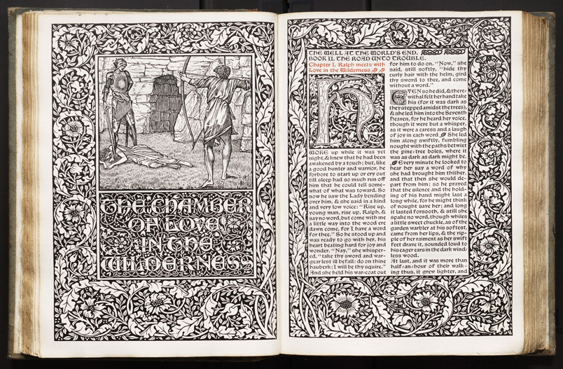
The Well at the World’s End wood cut and letterpress. 1886. Designed by William Morris of the Kelmscott Press and illustrated by Edward Burne-Jones
Charles Rennie Mackintosh of Glasgow, Scotland, is closely identified with the Arts and Crafts movement. However, he was not dogmatic about his work being handmade. He believed in two primary rules for design: include no features unnecessary for structure or convenience, and ornament should only enrich the essential construction of an artifact or structure, not conceal it. Mackintosh epitomized the versatility of the new breed of artist; he was a painter, an architect, a furniture designer, a graphic designer, and a textile designer. As such, he had a significant impact upon many artists and designers of his time.
 |  |  |
Charles Rennie Mackintosh, Stylised Flowers and Chequer work watercolors, 1915–1923
|
Charles Rennie Mackintosh, Orange and Purple Spirals watercolors, 1915–1923
|
Charles Rennie Mackintosh, Wave Pattern watercolors, 1915–1923
|
The Arts and Crafts movement quickly spread to the United States and was popularized by such people as publisher Elbert Hubbard and furniture designer Gustav Stickley. Both founded communal workshop studios in New York. But perhaps the best known American figure to emerge from the Arts and Crafts era was Frank Lloyd Wright, who is often referred to not merely as an architect, but as an “architectural designer.”
Wright took Mackintosh’s versatility one step further—he designed all aspects of his buildings, inside and out. Anyone who has visited a Frank Lloyd Wright house, such as Falling Water, knows that Wright designed everything: the linen closets, dinnerware, plumbing fixtures, lighting fixtures, window casements, carpets, and furnishings. It was hard to bring anything of one’s own into a Frank Lloyd Wright house. Wright extended the Arts and Crafts philosophy into the “prairie style” by incorporating elements of Native American design into his work. However, like Mackintosh, he realized that industrial technologies were necessary for innovation and economy.

Frank Lloyd Wright, Leaded Glass Window for the Avery Coonley Playhouse, Riverside, Illinois 1912
The center of the art world in nineteenth-century continental Europe was, of course, Paris. Three major events came together there as catalysts to change the prevailing aesthetic and critical models, and to create an art nouveau that would eventually evolve into the twentieth-century global term, modernism. In the 1840s, photography was patented and it quickly displaced the painters’ need to create super-real, highly modeled surfaces that depicted realist subjects and narratives.
In the 1860s, a printer and painter named Jules Cherét introduced color lithographic printing technology, and the graphic arts suddenly became a signifi cantly popular medium. Before Cherét filled the streets of Paris with his colorful posters, artists considered graphic art processes as merely secondary craft s that were commercial in nature, and therefore unworthy of consideration as “fine arts.” Now the processes became a source of inspiration for formal expression, much of which was inherent in their technical applications.
Finally, Paris became a Western window for non-European culture through trade and colonialism. Artists viewed exhibitions of artifacts from Africa, Asia, and other parts of the French colonial empire. This exposure had an influence on their work. The first extensive exhibition of Japanese woodblock prints was put on display in Paris in the 1860s. The reduction of form in the Japanese print images into elemental line, shape, color, pattern, and texture had a major impact upon post-Impressionist artists.
 |  |
Suzuki Haranobu, Girl with a Lantern, woodcut, 1760
|
Jules Cherét, Papier à Cigarettes Job, lithographed poster, 1889
|
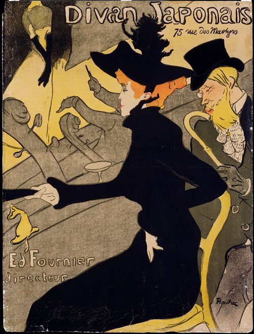
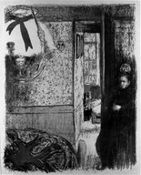
With colorful shapes, both fl at and textural, and with elegant sinuous compositions, the style of the Japanese prints lent itself well to adaptations into the new graphic art techniques. Not only did artists begin working in print, they also incorporated print methodologies into their other work, particularly painting. Further, Cherét’s techniques of using transparent overlays of color, optically mixing colors by using spray and spatter, and his range of brush techniques using a greasy ink called tusche—all influenced the work of such artists as Pierre Bonnard, Edouard Vuillard, and Henri Toulouse-Lautrec
Cherét used a basic palette of the primaries-red, yellow, and blue—in combination with black and shades of green. His spattering technique presaged four-color process printing. This came about 25 years after the invention of the halftone screen in the 1880s by English inventor and photographer, William Henry Fox Talbot.
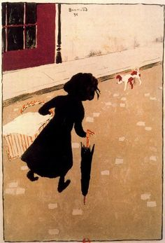 |  |  |
Pierre Bonnard, The Laundry-Maid, lithograph, 1896
|
Henri Toulouse-Lautrec. Divan Japonais, lithographed poster, 1893
|
Edoaurd Vuillard. Interior from the album, “Paysages et Intérieurs” lithograph, 1899
|
As Europe moved into the twentieth century, the new sensibilities toward artistic versatility and the reduction of form took hold in other parts of the continent. In the Netherlands, the De Stijl (The Style) movement became a defining force. Two of its leading innovators were Theo van Doesburg and Piet Mondrian. Van Doesburg can be characterized in the Mackintosh mold—a versatile artist, architect, and designer. He eventually joined the faculty of the Bauhaus in Germany after World War I. Mondrian, however, stayed within the philosophical confi nes of painting, gradually reducing his form to grids of rectilinear shapes, the primary colors, and black and white.
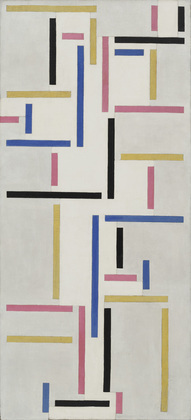 |  |
Theo van Doesburg. Rhythm of a Russian Dance, oil on canvas, 1918
|
Piet Mondrian. Composition 1916, oil, 1916
|
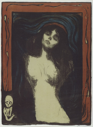
In Germany, Austria, and Scandinavia the movement was known as Jugendstil (youthful style).
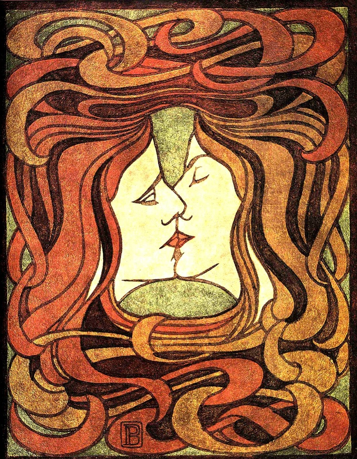 |  |
Peter Behrens. The Kiss, woodcut, 1898
|
Edvard Munch. Madonna, woodcut, 1895–1902
|
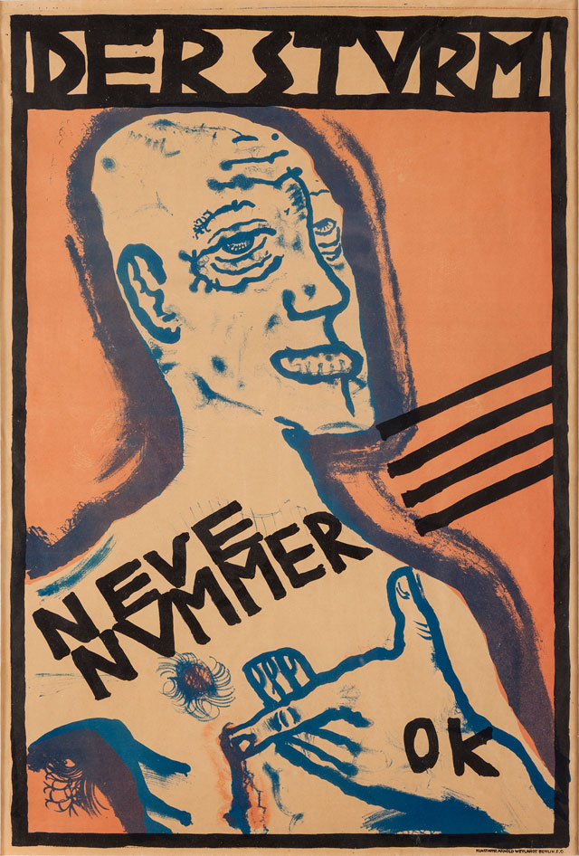
In Austria, the Jugendstil movement was taken up by a group of young artists who, led by the renowned Gustav Klimt, resigned from the Vienna Academy in 1897, and called themselves Secessionists. Architect Josef Hoffman was active in the secessionist movement and an admirer of Charles Rennie Mackintosh. In 1903, he founded the Vienna Werkstätte, modeling it after the communal arts and crafts studios in Scotland and England. The Vienna group included artists, architects, furniture designers, ceramicists, glassblowers, jewelry designers, and metalsmiths. Oskar Kokoschka was one of the most well-known painters associated with the group. Kolomon Moser was one of its most accomplished and versatile artists. He was a furniture designer, a glass artist, a metalsmith, a stage set designer, a painter, and a graphic designer.
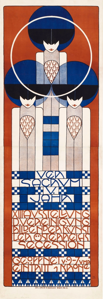 |  |  |
Koloman Moser. Secessionist Poster, lithograph, 1902
|
Gustav Klimt. The Hostile Powers (from the Beethoven Frieze), 1902
|
Oskar Kokoschka. Self Portrait: Poster for Der Sturm, lithograph, 1911
|
In Russia, the artistic community was caught up in the political upheaval that would lead to the Bolshevik Revolution. Many artists, such as Kazimir Malevich, were activists for reformation and for them political change also required a reordering of visual language. After experimenting with post-Impressionistic styles and Futurism, Malevich turned to compositions reduced to pure geometrical form that he called Suprematism. However, the general term given to much of the art generated in the early days of the Russian Revolution is Constructivism. It was the title of a book by typographer and graphic designer, Alexei Gan, which was published in 1922. In reference to the constructivist aesthetic, Gan stated, “Nothing will be accidental; nothing will derive purely from taste or an aesthetic tyranny. Everything must be given a technical and functional meaning.”
Proponents of Constructivism concentrated on the use of geometric forms to reorder their visual language and aesthetic model. After the revolution, several artists came together in Moscow to organize the curriculum of the Vkhutemas School. It was a communal enterprise, but unlike the workshops of the Arts and Crafts movement that resisted technical progress, it had a specific political agenda to advance the Marxist doctrine of Lenin, and its leaders fully supported any technological innovations that would enable them to reach the widest audience. The department in the Vkhutemas responsible for advertising the political agenda was called the Institute of Artistic Culture, or INKhUK. Alexander Rodchenko, who was the head of the Vkhutemas School during the 1920s, stated that “Construction is the appropriate utilization of primary material properties...the only fully authentic construction is a designed object or structure in real space.”
Art had to be utilitarian and, accordingly, the school emphasized industrial design, product design, and graphic design. It is interesting to note that one of the most useful and enduring design products to come out of the Vkhutemas was the folding chair. Since much of the new political agenda was spread by speakers going from town to town on trains, a large number of chairs could be carried on the trains to accommodate the crowds that would come to hear the speakers. Film was also an important propaganda tool for the revolution as well as for entertainment. The Stenberg Brothers, Georgii and Vladimir, were innovative designers who specialized in film and cultural posters.
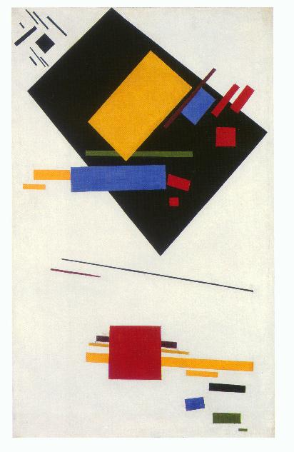 |  |
Kazimir Malevich. Suprematist Painting, oil on canvas, 1915
|
Lazar El Lissitzky. Hit the Whites with the Red Wedge, lithographed poster, 1919
|
 |  |
Alexander Rodchenko. Poster for Rezinotrest, the State Trust of the Rubber Industry, 1923
|
Georgii and Vladimir Stenberg. Chelovek’s kinoapparatom, lithograph, 1929
|
“There are not, nor have ever been,
any better baby dummies (pacifiers).
They are good for sucking
until you reach an old age.
Sold everywhere.” Vladimir Mayakovsky
After World War II, the new vocabulary and aesthetic models were formulated into a curriculum in Weimar, Germany, by architect Walter Gropius, who founded the Bauhaus. The Bauhaus shared the postwar, formalist aesthetic of the Vkhutemas School, but its political philosophy tried to strike a balance between a capitalist economy and a socialist doctrine. Continuing in the Arts and Craft s spirit, Gropius developed a curriculum that emphasized the application of artistic skills to industrial and technological processes. The Bauhaus teachers were called masters and its students were referred to as apprentices and journeymen.
The Bauhaus presented a humanist philosophy through which humans were to learn to control and direct technology. According to Lazlo Moholy-Nagy, the school provided “a foundation for an organic system of production whose focal purpose is man, not profit.” It rejected an “art for art’s sake” philosophy, but it liberally assimilated a concept of art that included individual expression as well as psychological and spiritual sources for content and form. However, it rejected any notion of bourgeois academic realism.
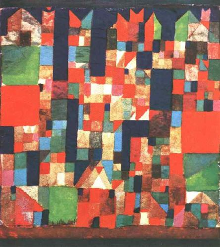
The Russian painter, Vassily Kandinsky, was expelled from the Vhkutemas after publishing his volume, Concerning the Spiritual in Art, but was welcomed by the Bauhaus. Paul Klee stressed the importance of forms found in nature and architecture as source material; he later published Pedagogical Notebooks. Both Kandinsky and Klee continued the foundation course concept that had been started by Johannes Itten.
Joost Schmidt and Herbert Bayer introduced a new aesthetic concerning the use of typography as a design medium. Taking a cue from the geometry of the Constructivists, they saw typographic text functioning rhythmically as line, shape, and value. Schmidt and Bayer introduced the design and use of sans serif typefaces that became a Bauhaus trademark. The dynamic of typographic composition was also taken up by the Futurists and the Dadaists.
 |  |
Wassily Kandinsky, Composition X, oil on canvas, 1939
|
Wassily Kandinsky, Composition X, oil on canvas, 1939
|
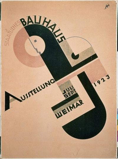 |  |
Joost Schmidt. Staatliches Bauhaus Ausstellung (National Bauhaus Exhibition), lithograph, 1923
|
Paul Klee. The Window, oil, 1922
|
Before being shut down in 1936 by the Nazis, the Bauhaus faculty and artists crystallized the term modernism and shaped the pedagogy for Western design education. The Bauhaus influence on design and art education in the United States was huge as many artists immigrated there to escape religious and political persecution. For example, Walter Gropius, Marcel Breuer, and Gyorgy Kepes went to the Harvard School of Design. Lazlo Moholy Nagy settled in Chicago and created the New Bauhaus that eventually became incorporated into the Illinois Institute of Technology. Architect Mies van der Rohe also went to the Illinois Institute of Technology. Herbert Bayer relocated to an old mining town in the Colorado Rockies named Aspen, which he turned into a resort center and where he started a design academy. Josef and Anni Albers moved to the Black Mountain School in North Carolina, and Josef later became head of the Yale School of Art.
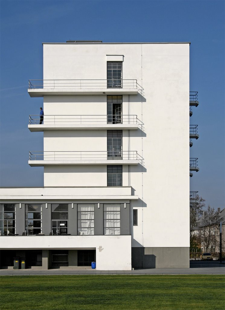 |  |
Walter Gropius, The Dessau Bauhaus building seen from the southeast
|
Walter Gropius, façade of the east unit, student residences, 1925–1926
|
 | 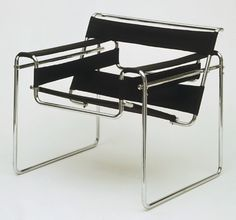 |
Marcel Breuer, Armchair, Model B3, Chrome Plated tubular steel with canvas slings, 1927–1928
|
Marcel Breuer, Cantilever Chair, tubular steel with caning, 1928
|
 |  |
Lazlo Moholy-Nagy, Title page for “film und foto” exhibition catalog, 1929
|
Herbert Bayer, lithographed poster for the Section Allemande, Paris Exposition, 1930
|
 |  |
Herbert Bayer, design for a newspaper kiosk, gouache and collage, 1924
|
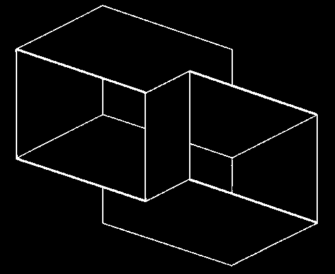
Josef Albers, Structural Constellation, machine-engraved vinylite, ca. 1950
|
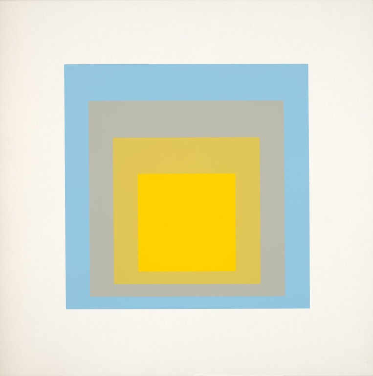
Josef Albers, Homage to the Square, screenprint, 1962
The formalist philosophies and theories of the European émigré artists and teachers had a profound influence on American art beginning in the early 1950s. It was the genesis of a new abstract expressionism in American art that rejected the country’s traditional narrative realism. Instead, it now stressed formalism, and it brought the center of the art world from Europe to New York City. Critic Clement Greenberg provided a voice for the new movement, and artists such as Robert Motherwell, Willem de Kooning, Franz Kline, Jackson Pollock, and Barnett Newman became some its leading figures.
The foundation concept that was formulated by Johannes Itten for the Bauhaus curriculum, with many modifications, is still used today in most college and art school fine art programs. The formal elements and principles of design remain the same, but are now also applied to time-based, electronic media such as video and digital animation. In a postmodern foundation curriculum, more emphasis is placed on combining formal investigation with content issues and narratives. Yet the concept of the artist is still very similar to the model represented by Charles Rennie Mackintosh: the artist must be interdisciplinary in nature, seeking knowledge from diverse sources, and prepared to apply that knowledge through many media.