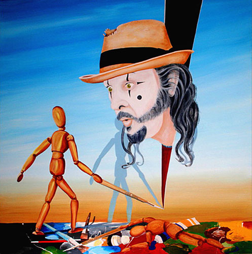
Why your theme intrigues you or is of particular interest to you:
The media and materials you are using:
Why are you using them?
How does it tie into your theme?
Describe what you principles and elements of design (or metaphor or symbol) you are working with and how it ties in to the theme and concept:
Describe the compositional tools that you are experimenting with and how they ties in to the theme and concept:
List the artists or schools of art that are influencing you.
Describe how they are influencing you.
Begin to form these ideas into two paragraphs answering the two Commentary Questions above. Examples: Concentration Commentary Example 1
My concentration is a series of abstractions constructed using pastel and ink. I decided to explore the concept of stylizing various shapes and designs found in both nature as well as technology. I chose to focus on zooming in on specially the lines and shapes of these designs and creating animate abstractions from them.
When I first started my concentrations, I created my abstractions from still lives that I had set up. These first concentrations, such as numbers 1, 2 and 3, were geometrically balanced and had an overall scheme to them which prevented them from having a clear focal point. However, I widened the variety of pictures from which I was creating my abstractions and began focusing on computerized designs and images from nature. I focused on the movement of the lines in each picture and embellished them to that they could embody the shape of the design. The negative spaces that the ink encompasses become the placeholders for the color. The lines eventually began to transform into shapes themselves, such as in concentrations 7 and on. The color palette also began to change as my concentrations progress; I began with mostly analogous colors but eventually became more confident in my color choices. Starting with concentration number 9, I began exploring with complimentary colors and different blending techniques. The transformation of my concentrations enabled me to create this seemingly spontaneous series. However, each piece required careful planning and drafting which was later become more complex and intricate. Concentration Commentary Example 2
I was interested by the possibility that ordinary games could be depicted dramatically to evoke a sense of grandeur. I sought to find unusual vantage points that a player might not normally see. I used charcoal to establish dark rich volumes and ebony pencil to render intricate details and subtle reflections. In my series, I placed special emphasis on perspective, illusion of depth, and exaggeration of proportion to give the game pieces a definitive, towering prominence in the composition.
From the beginning, I employed spatial and proportional exaggeration as a means to lend to the game pieces an air of importance. Starting from my first drawing, I employed a “peek-a-boo” effect, enlarging a pawn at the corner of the composition in order to break the page, create an illusion of depth, and most importantly create a bridge from my vision into the world of the audience. In # 3 (Connect-Four), I began to embrace an ant’s perspective and the Connect-Four slots became a majestic monolith. This was a theme I carried throughout my 7th and 8th pieces in which the “Sorry” pieces and beer bottles, respectively, served to create a distinct world—almost a maze, through which the ant—and the viewer’s eye—wanders. Beginning with #10 (mahjong), I developed the concept to depict game pieces in such a way that they seemed to be falling on top of or speeding towards the viewer, establishing a more dramatic atmosphere. This was achieved by juxtaposing objects of extreme proportions to really attain that “in-your-face” feel. The concept is apparent in both my 10th piece, in which the mahjong piece seems to begin descending onto the viewer, and my 11th piece, in which the large king chess piece held by the hand is almost an ominous overhang above the viewer, almost as a human foot would crush an ant. This impression was perhaps best captured in my final piece, in which the die assumes massive proportions and seems to be speeding towards the face of the viewer.
Concentration Commentary Example 3
My concentration revolves around the theme of isolation and alienation in the modern world using the subway as my context. I was intrigued by the downcast and exhausted body language and expressions of commuters in transit. I found the subway particularly evocative because, despite the suffocating proximity and unusually closeness of the other commuters, each person was intently contemplating their own lives, completely unaware that everyone else was consumed by the same personal reflection. The concept behind my concentration was always about the isolation of people in modern society but my pieces evolved from simply observing commuters to making the viewer become a part of the scene. In #’s 1-3 there is a definite separation between the viewer and the piece but by #12 the viewer feels as if they are on the subway, being tilted and pushed into the mass of humanity around them. In #4 I reached a turning point in my work because the viewer was invited to become another passenger on the subway. I began adding cut paper and elevating my focal points form the paper in #5 to further show the chaotic atmosphere of the subway. In preparation for each drawing I began taking pictures undetected on the subway that often turned out at strange and tilted angles. I began to employ this tilted perspective in the background of #6 to further emphasize the jostling of the subway. Having established the crowed feeling I began to use the harsh florescent lighting of the subway to emphasize the focal point in each piece. I began exaggerating the contrast on the clothes and especially the faces of my subjects in #10 to illustrate the downcast and pensive expressions of someone caught up in their own thoughts. In addition, I drew on paper bags to show the leathery and alienated faces of commuters in a working community. I made the subway out of tracing paper because it captured the boldness of the black and white charcoal, which created the uninviting and cold surface of the subway walls. In the same piece I began to vary the distance of my subjects from the viewer, intensifying the allusion that the viewer was a commuter on the train as well. In #12 I further increased the contrast of the piece so that the majority of the commuters were hidden in the dark underbelly of the subway while my focal point was bathed in the alienating glow of the lights above, isolating him from the surrounding people.
Goal: Use the tilt-shift effect on 3 historic artworks and 3 real life scenarios.
Studio Activity:
Tilt-shift photography is a technique that makes real objects appear small, as if they were part of a miniature scale model. This is achieved through blurring and distortion - either with special camera lenses (Nikon or Canon); lens adaptors (Hasselblad), digital manipulation, or using an app or Photoshop. There are also websites that convert images to tilt-shift photos (http://tiltshiftmaker.com )
Start with a high quality, well lit, in-focus photograph; take the photo from above and to the side as if looking down upon a scale model. Choose a relatively simple scene and make sure people are small.
Be inspired by the work of Serena Malyon > http://goo.gl/8Ri7 that applied the tilt-shift technique to famous Van Gogh paintings. The effect took flat, 2D images and gave them the illusion of 3D scenes from the past.
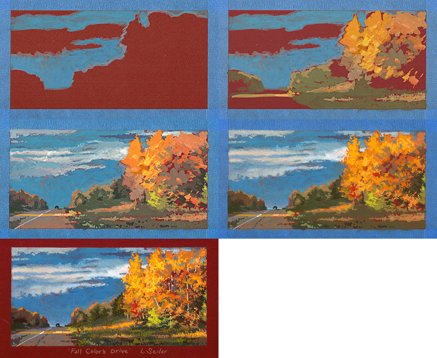
Goal: Create a Landscape painting using a Grisaille Underpainting Technique
Concept:
Edgar Payne said, "A really good painting requires 'color vibration,' where each color feeds off one another. An undertone assures that one color is sensed all over the piece pulling the work together.
Studio Activity:
Use an underpainting tone then paint a complementary based color scheme on top.
A red underpainting will enhance the greens of nature to vibrate and energize yet pull the work together harmoniously.
Design Thinking > Artist Habits of Mind Everyday Westosha Art students are performing tasks requiring college level abilities of skill and knowledge. Throughout the school year, band and choir students compete for and win awards by performing college level material. Art students submit college level art work to the Advanced Placement College Board to earn 3 college credits. Like an athlete who puts themselves out there to compete and perform at optimum levels, so to do our art students who put themselves in front of judges and curators that evaluate and reward their efforts. We believe there are two deterrents in place here at Westosha CHS that stifel an art students full potential to participate. 1. extra graduation requirements and 2. scheduling. We believe that a boon for the students would be a STEAM approach to the STEM movement. For more information, I encourage you to click through posts on Westosha FAD here > http://goo.gl/Qt60ky This document highlights information about Westosha Band > https://docs.google.com/document/d/1wiFsTxDtJE1EaavvFW6L-A2Q7JddgqkFaNaEjfDpj_c/edit?usp=sharing The slideshow highlights Westosha Art's beliefs and strategies to promote and encourage this high level of performance. If you have any questions or would like to continue this conversation, do not hesitate to contact me > kuepper@westosha.k12.wi.us or 262-843-2321 x324 Thank you for viewing.
Goal: Create 3 multi-exposure images by combining multiple exposures within one photograph to create the illusion of many identical elements within a composition.
Studio Activity:
Be inspired by the work of Lera > http://goo.gl/Hlo1PW in which several mystical figures move dramatically within the frame. Watch the video by Ultimate PhotoGuide explaining one method of easily combining multiple exposures >https://youtu.be/xVP1GkJvJfU . Another method is the Pano-dash shown in this video > https://www.youtube.com/watch?v=fTz4Nhgm_SQ Set up a tripod or a DIY tripod as in this video > https://www.youtube.com/watch?v=fTz4Nhgm_SQ at 1:55 and shoot multiple shots from the same location having an individual move about.
Designing is creating conceptual and visual unity by giving order to diverse but interrelated and interdependent parts.
Access Prior Knowledge:
“Through the volume of space, we move, see forms and objects, hear sounds, feel breezes, smell the fragrance of a flower garden in bloom” ~ Francis D.K. Ching
New Information:
Space
Space is either...
...an objective (or external) reality
...a subjective (or mental) construction
As an objective reality, space interacts with for to determine the shape of a visual image. As a subjective construction, it is an imaginary phenomenon that is manipulated by imagination and fantasy.
The Distance Between Things
The physicist is concerned with space that can be measured by math and geometry. The artist manipulates space and form in an objective way to establish physical arrangements within a spatial frame. Francis Ching describes space as a material substance like wood or stone yet inherently formless.
The Interval Between Points in Time
We mortals live within a linear time-space. Things and events are separated by points in time. “What we call length is a duration of experience measured in time.” ~Buckminster Fuller
Space can be defined as something which encapsulates forms. Although it is usually thought of as ‘empty,’ to the designer, poet or musician, space is real with boundaries and limits.
A Cognitive Phenomenon
The space between objects in a visual field is measured by binocular vision in which dual images are transmitted to the brain through electro-chemical impulses and then fused to establish spatial references.
A Subjective Phenomenon
Daydreams and fantasies are subjective visual constructions. In the mind’s eye, such visuals are exempt from the restrictions of chronological time and space. The mind can collapse space and time, reverse them or mix them with other time-frames. Subjective space is never fixed or static but flexible and able to present simultaneous fusions of past, present and speculative future events.
A Way to Organize Visual Elements
Artists can work with illusory space (the 2-dimensional space of drawing, painting or photography), or actual space (the 3-dimensional space of sculpture or architecture).
Sighting (drawing by eye) is a process of comparing the relationships of angles, points, shapes and spaces. Notice how shapes and forms visually change as you change your position or perspective. You can use your pencil or fingers to 'calculate' the angles of the shapes edges relative to the horizontal and vertical.
Position yourself facing a corner of a room. The edges of your paper are horizontal and vertical guides. 1. Find a vertical corner (where two walls come together) and draw that straight vertical line on your paper. 2. Sight the upper corner (where the ceiling meets the wall) and notice the angle at which those lines leave your pencil. 3. Draw those lines leaving the vertical line at the same angles. 4. Do the same sighting and drawing at the bottom of your vertical line (where the walls meet the floor). 5. Work your way down the walls, check every angle (moldings, pictures, doorways, windows...) relative to vertical and horizontal. 6. Sight the relative widths and lengths of walls, cabinets, furniture or other objects in the room.